The general guidelines below apply to most types of digital content, including but not limited to: web pages, digital documents (PDFs, Word Documents, Google Docs, Powerpoint presentations). Because these best-practices are so widely applicable, we have compiled them all in one place for convenience. 

Accessible content, regardless of the platform, should be: perceivable, operable, understandable, and robust (POUR) to all users, including those with disabilities. These are the four essential principles of accessibility as set by the current version (version 2.1) of the Web Content Accessibility Guidelines (WCAG 2.1) created by the World Wide Web Consortium (W3C). How does this apply to digital content?
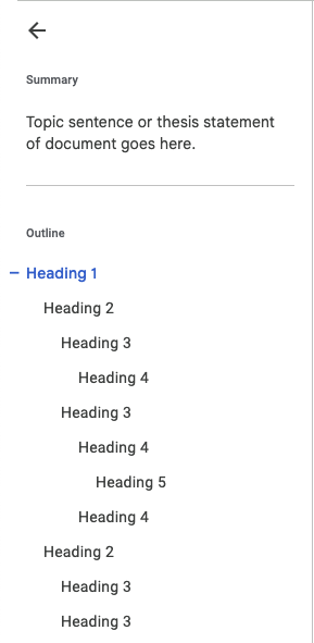
Semantic Headings

In this section we review the appropriate usage of headings in digital content, and how this usage helps make the content perceivable, operable, understandable, and robust. For further reading about the proper usage of semantic headings in digital content, consult the W3C Headings page or the SBCTC Headings Canvas Page.

Headings should be used hierarchically to organize your content into sections. Screen readers (a type of software the assists blind and low-vision users) read only the headings at the first level initially, allowing the user to decide which topic to read more about. Headings are a semantic element in document editors (and HTML webpages), meaning that they explicitly delineate content when they are used. Changing the font, font size or font weight (boldness) of text may communicate this delineation to sighted users, but this is considered implicit delineation. The issue with this type of organization is that it appears differently to sighted users than it does to users assisted by screen readers. To communicate this delineation to all users, use the document or web page editor's Heading (or Text Style) tool.

Google Docs Example

Microsoft Word Example

Principles

Alternative Text

In this section we review the appropriate usage of alternative text in digital content, and how this usage helps make the content perceivable, operable, understandable, and robust. For further reading about the proper usage of alternative text in digital content, consult the Microsoft Alt Text Tutorial or the W3C Image Alt Text Decision Tree. The State Board also provides a Canvas page on Alt Text

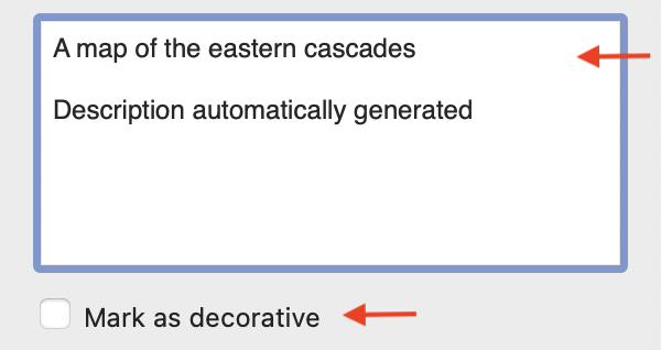
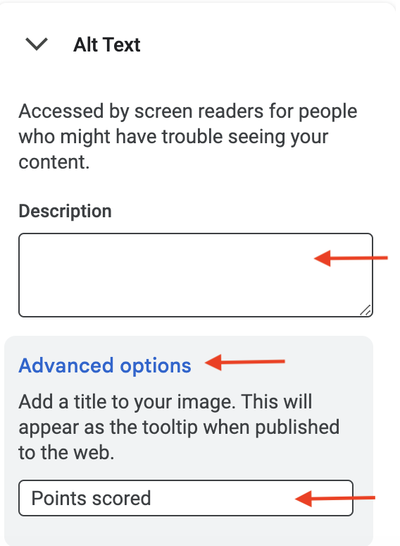
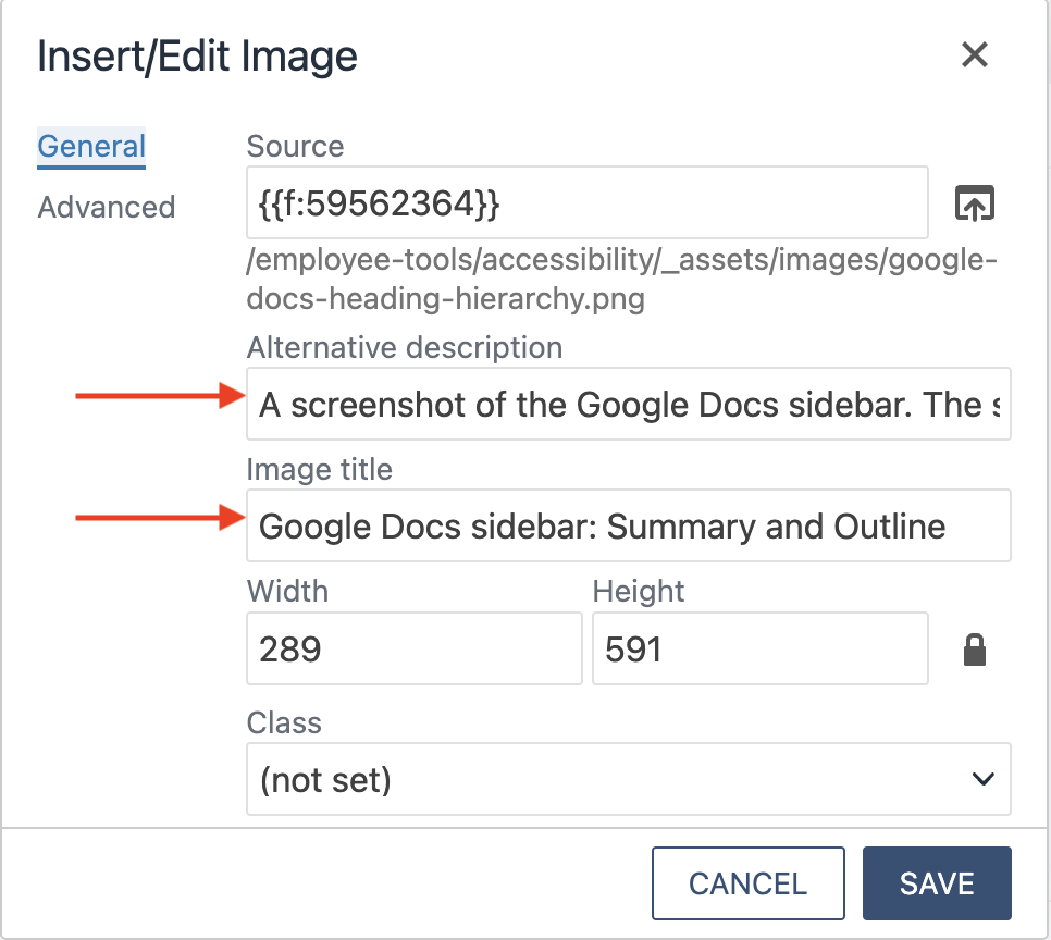
Titles and descriptions provide alternative, text-based representations of the information contained in tables, diagrams, images, and other objects. This information is useful for people with vision or cognitive impairments who may not be able to see or understand the object. A title can be read to a person with a disability and is used to determine whether they wish to hear the description of the content.

Principles

Tables

In this section we review the do's and do not's of table usage, and how this usage helps make the content percievable, operable, understandable, and robust. For further reading about the proper usage of tables in digital content, consult the W3C Tables page or the SBCTC Tables Canvas Page.

Tables should be used for data, not for layout. Tables complicate user experience for screen reader users, so it is best to avoid them unless necessary (for compiling data). Column layouts are available on most web-page and document editors, and should be used for layout in place of tables. Table row/column headers and footers and alt text make navigation easier and quicker.

Platform Considerations

  • Google Docs doesn’t support row/column header and footer options, but Microsoft Word does. If your document requires the use of tables, your best option is to convert it to a Word document.
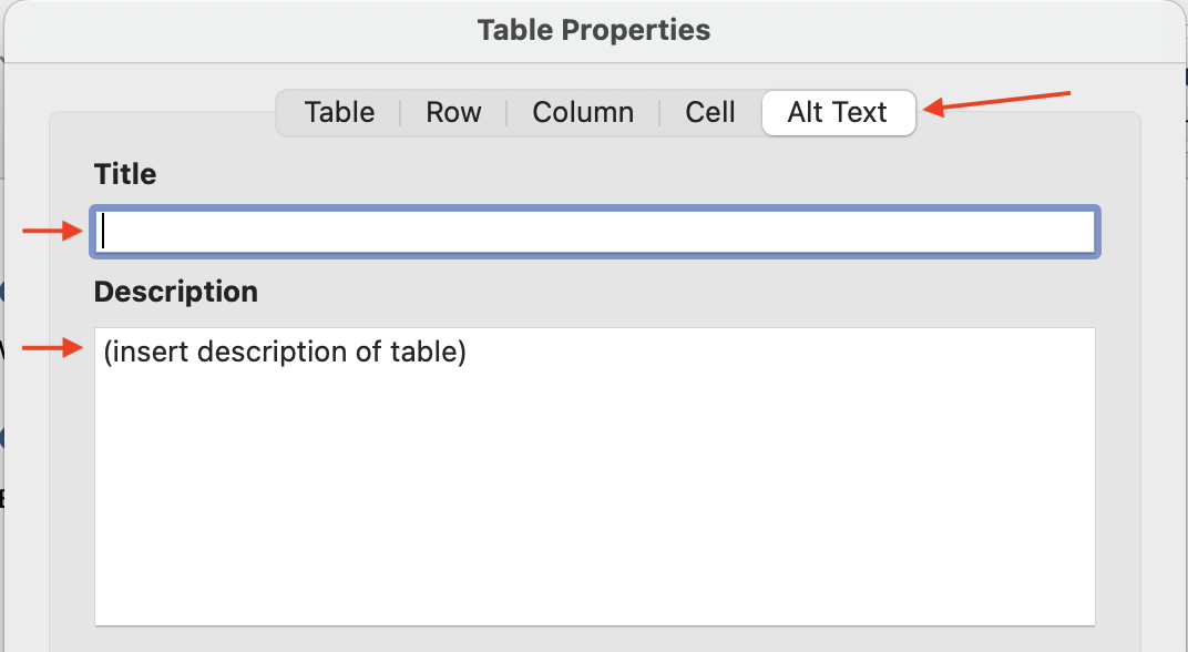
  • On Microsoft Word, tables have 2 fields for alt text, a title and description.
    • The title is read by screen readers first. The user can then decide if they want to hear the table’s description, and if they want to read each individual cell.
    • These fields are not available on Google Docs and web-pages.

Principles

Ordered and Unordered Lists

In this section we cover ordered and unordered lists, that is numbered and bulleted lists, and how this usage helps make the content percievable, operable, understandable, and robust. For further reading about the proper usage of semantic lists in digital content, consult the W3C Content Structure page (Lists section).

Whether ordered or unordered, lists should be semantic. This means the list tool(s) should be explicitly used, and "fake" or implicit lists (those created by unformatted asterisks, dashes or numbers) should not be used. Most platforms convert these implicit lists automatically, but still others (like Omni CMS) do not.

Best Practice Do's

  • Use the list tool(s) to create explicit semantic lists.
  • Use bulleted lists only for unordered, related information.
  • Use numbered lists only for ordered information.
  • Keep nested lists to a maximum depth of 3.
    • This is a nested list. It is created when you have a single level list and you hit Tab on one of the items.

Principles

Typography and Readability

Typography for accessibility refers to the design and use of text to make it easy and comfortable to read for people with different abilities and preferences.

Readability is about the overall reading experience and how well the information can be read and understood, while legibility is the ability to recognize characters in a typeface.

Further Reading

To learn more, consult the help pages listed below that are most relevant to the technologies you will be using.


Contact Accessibility Coordinators

  David Wallis, Director of IT Services/Technology Accessibility Coordinator

   (360) 442-2251
Fax: (360) 442-2259

  Mary Kate Morgan/Director of Disability and Access Services & Special Populations

   (360) 442-2341
  mmorgan@lowercolumbia.edu